ShopDreamUp AI ArtDreamUp

Deviation Actions


Suggested Deviants


Suggested Collections


You Might Like…


Featured in Groups


Description
LIKE AND FOLLOW ME ON FACEBOOK www.facebook.com/georgelovesya…
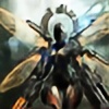
Cyborg Ninja design I've been working on recently. Not finished yet but though I'd put it up to get some critiques, will be working on it more over the next few days, let me know what you guys think!
Cyborg Ninja design I've been working on recently. Not finished yet but though I'd put it up to get some critiques, will be working on it more over the next few days, let me know what you guys think!
Image size
5300x2873px 19.93 MB
© 2013 - 2024 GeorgeLovesyArt
Comments33
Join the community to add your comment. Already a deviant? Log In
There are no words for how many boners I'm popping right now. This image is my new fetish. Let's delve into what you've done right and what I think you can improve upon!
First off, your inspirations are clear and are incredibly effective. You've clearly seen a lot of Kojima productions stuff- the photonic circuitry of ZoE mixed with the plating and humanistic designs of Metal Gear are a potent combination which you've captured with extreme elegance.
This said, because the styles are so readily identifiable their inclusion could be a clear detriment without claiming that this is in itself fanart. Which it clearly isn't given the organic elements of the image, which are an incredibly effective juxtaposition against the hard metal of the picture.
Another thing I think could be easily improved is the composition of the piece- shifting the focus slightly to the right, or expanding the frame to the left would significantly up the flow of the image. As it stands the figure feels a little... Stodgy, maybe? I can't think of the word, but given how incredibly technical and impressive this image is it seems almost a shame to let shot composition let it down.
The background is simplistic and doesn't detract from the focal point, which is good, but it's also a little unclear and could be improved upon relatively easily.
All in all, a great piece. Congratulations. I hope my observations help you to become an even better artist than you are now!